House price trends are one of the most important indicators of a neighborhood’s economic health, and understanding how these trends vary within the City of Chicago and suburban Cook County is critical to those working to develop policies and investment strategies sensitive and responsive to local market dynamics and household financial conditions. To help housing stakeholders, policymakers, and the public understand this issue better, the Institute for Housing Studies (IHS) has developed a new submarket-level Cook County house price index to track quarterly price trends for single family homes in 16 submarkets in the City of Chicago and 17 submarkets in suburban Cook County.
Introduction
In recent years, substantial focus has been paid to the importance of house price trends as a national or regional indicator of economic conditions, but growing attention is being paid to the implications uneven price declines and recoveries across neighborhoods have for communities and their residents. Neighborhoods with rapidly rising prices may be those facing current or future housing affordability concerns, while areas with slow price recovery may need strategic investment to rebuild demand for housing. Additionally, the uneven nature of house price declines and recovery across neighborhoods is a stark illustration of the growing divide between thriving and struggling communities and households. Home equity is one of the key vehicles for families to build wealth, and the variation in price trends can be an indicator of household financial conditions across communities measured by the level of home equity gained and lost by households and neighborhoods over time.
IHS Cook County Submarket Index
The submarkets in IHS’s price index are based on Public Use Microdata Areas (PUMAs) from the 2010 US Census. There are 16 submarkets in the City of Chicago and 17 that are primarily in suburban Cook County. In the City of Chicago, the submarket surrounding the Loop has been excluded because of insufficient levels of single family home sales. Click here for a reference guide to the community areas and suburban municipalities found in each submarket. Additional detail about the model can be found at the end of this analysis.
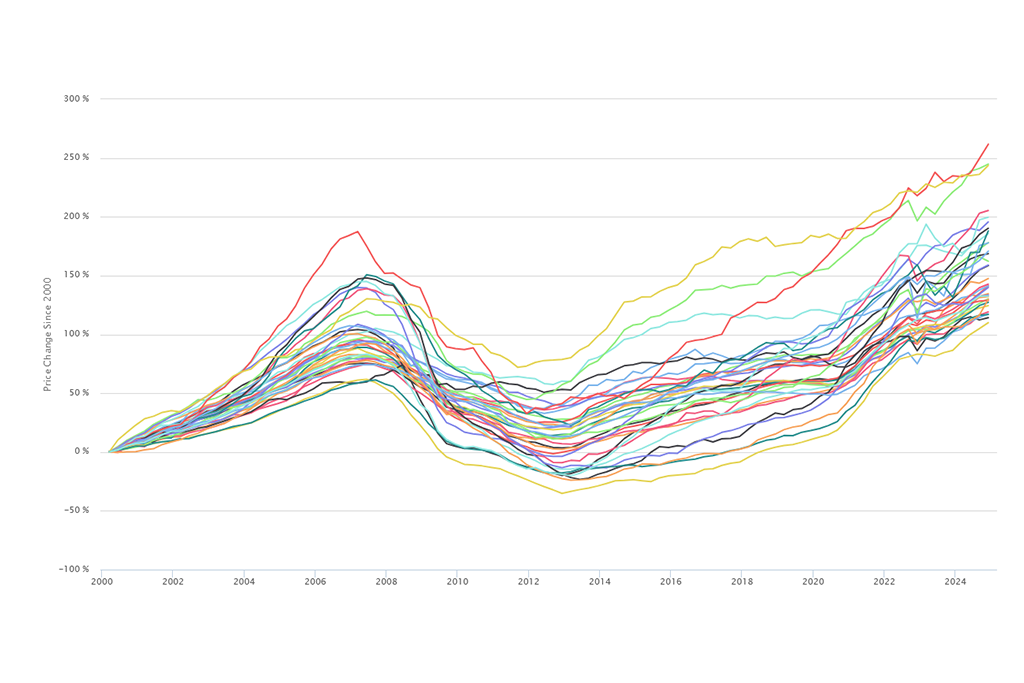
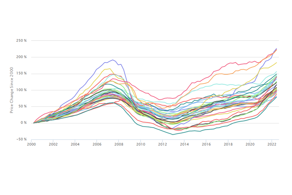
The discussion below highlights three key metrics for analyzing house price trends and describes their patterns and their implications for communities. All trends are through the fourth quarter of 2014. The interactive graph below highlights trends for all submakets. To view a full page interactive graph with a map and data for all submarkets go here. Underlying price index data can be found here.
Peak to Current –This metric measures the difference between a submarket’s peak price level at the height of the housing boom and the current price level as of the fourth quarter of 2014, and it captures the recovery of a neighborhood’s house prices towards previous price peak levels. Often, neighborhoods that saw substantial build up in prices during the housing bubble, experienced equally dramatic declines. While, those price peaks were often inflated and unsustainable, recovery towards those peaks is an important benchmark for homeowners who bought their homes or obtained a mortgage from 2005 to 2007 when prices were at their highest. Many homeowners are reluctant to sell their homes for less than what they paid, and, in cases where a mortgage is involved, areas that are well below previous peak values are likely to have larger numbers of underwater or near underwater homeowners.
As values get closer to previous peak levels, more homeowners are likely willing and able to sell, more households will exit underwater status, and equity lost during the housing crisis is rebuilt. In areas where values remain well below peak levels, many homeowners likely remain underwater. Owning more on a mortgage than what a property is worth limits an owner’s ability to sell their property and puts a greater strain on a household’s financial conditions.
Figure 1 maps Cook County submarkets based on the change in peak to current price levels. Areas that are closest to recovering to previous peak levels are those that had fairly modest price declines from that peak and have experienced steady or strong price recoveries since, and these areas typically have the most stable housing markets. Examples in the City of Chicago include Lincoln Park/Lakeview and Lincoln Square/North Center. These areas experienced below average price declines during the crisis and as of the 2014 4Q were close to recovering to those previous peak levels. In the suburbs, Winnetka/Northbrook is the closest to recovering to previous peak levels at 10 percent off peak.
Areas well below peak levels saw dramatic price declines over the housing crisis. In many cases, these areas saw rapid appreciation in the build up to the housing bubble and very limited recent price improvements. In the city, prices in areas such as Englewood/West Englewood, Humboldt Park/Garfield Park, and West Pullman/South Chicago are all over 55 percent below what they were at the peak. In suburban Cook County, south Cook contains two of the submarkets that are furthest from previous peak levels with Chicago Heights/Park Forest nearly 45 percent off peak and Calumet City/Harvey over 52 percent off peak.
.jpg") Figure 1 Map of Peak to Current Price Change
Figure 1 Map of Peak to Current Price Change
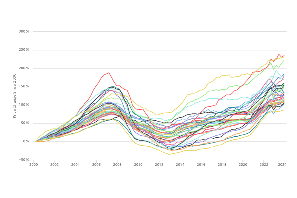
Price trends since 2000 – This metric tracks the change in price levels from the first quarter of 2000 to the fourth quarter 2014 and measures long term price trends. The variation in neighborhood price trends since 2000 is a key indicator of the impact the housing crisis and uneven housing recovery has had not just on local housing markets, but also on long term homeowners. Home equity is a key asset for both lower- and higher-income households, and increasing equity over time is one of the ways that both lower- and higher-income households build wealth. Areas where there has been limited long term price appreciation are areas where long time owners benefit less from increasing home equity compared with long term owners in areas with significant appreciation.
In the City of Chicago, areas that have seen the greatest price appreciation since 2000 include West Town/Near West Side, Logan Square/Avondale, and Lincoln Square/North Center, all of which have seen prices of single family homes more than double through the fourth quarter of 2014. Other areas in the City of Chicago have seen far weaker price appreciation since 2000 and, in some cases, even price declines. Single family homes in South Chicago/West Pullman and Englewood/Greater Grand Crossing are selling for less than they did in 2000, while prices in Auburn Gresham/Chatham a roughly the same as what they were in 2000.
In the suburbs, Winnetka/Northbrook has seen the most price growth since 2000 with single family home prices increasing by over 60 percent. The south suburban areas of Chicago Heights/Park Forest and Calumet City/Harvey have experienced the most dramatic price declines in the county. Prices of single family homes in Chicago Heights/Park Forest are down nearly 11 percent compared to 2000 while prices in Calumet City/Harvey are 22 percent lower than they were in 2000.
A simple example of how long term price trends affect an owner’s home equity is to look at two hypothetical families that purchased homes in 2000 in two different neighborhoods. One lives in West Town/Near West Side and the other in Auburn Gresham/Chatham. Figure 2 charts changes in the estimated value of two properties purchased in each of these areas in the first quarter of 2000 for the median value of properties purchased that year: $320,000 in West Town/Near West Side and $85,000 in Auburn Gresham/Chatham. Tracking price changes over time, both properties experienced price appreciation during the housing boom, but values in Auburn Gresham dropped dramatically after 2007 and only recently began a modest recovery in late 2013. The property in West Town/Near West Side also had declines in value during the housing crash. However, price declines were less steep than in Auburn Gresham/Chatham, and prices began recovering two years sooner in the second half of 2011. By the fourth quarter of 2014, single family homes in West Town/Near West Side had seen prices increase by over 119 percent since 2000 while prices in Auburn Gresham/Chatham increased by less than two percent over that same period.
The property in Auburn Gresham/Chatham would be worth roughly $86,500 today, $1,500 more than it was purchased for in 2000. Assuming the property was purchased with a mortgage, any home equity gains would have been built solely based on paying down the mortgage principal. However, the property in West Town would have more than doubled in value and appreciated to over $700,000. If it was purchased with a mortgage, in addition to the principal paid down on the mortgage, the owner would have built over $380,000 in additional home equity. While this simplified example removes many of the complexities of homeownership that may have occurred in the intervening years, it illustrates the potential long term wealth building opportunity that owners in West Town benefited from, but owners in Auburn Gresham did not.
 Figure 2 Estimated change in value of typical homes purchased in 2000 in West Town/Near West Side and Auburn Gresham/Chatham
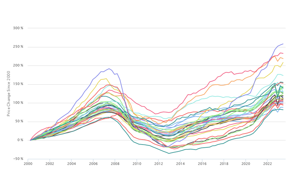
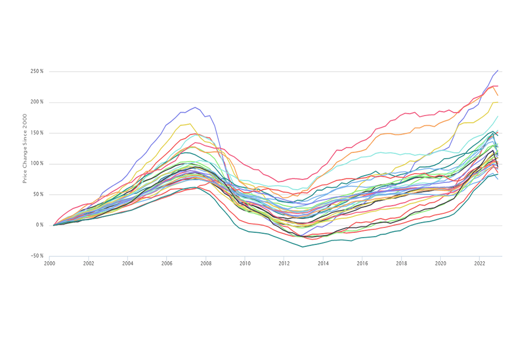
Recovery from Bottom – This metric measures the change in price level from a submarket’s lowest point after the 2008 collapse of the housing market to the fourth quarter of 2014. It tracks the speed of recovery of single family house prices from the point that prices in that submarket reached their recent lowest price level. This indicator is an important measure for recent buyers who purchased properties near the bottom of the market and who are trying to understand the return on that investment. It is also a valuable indicator for understanding where investment has been flowing in recent years. This “recovery” metric is a product of recent demand for housing outstripping the supply of homes for sale in these areas. This demand could be driven by owner occupants competing for a limited supply of for-sale housing in “hot” markets or investors competing for the dwindling supply of low cost properties in more distressed markets.
This recovery metric should be interpreted in conjunction with other price trend data points. In the City of Chicago, the two areas with the largest price increases since reaching bottom are Logan Square/Avondale and Humboldt Park/Garfield Park. Both areas have seen prices of single family homes increase by over 40 percent since reaching low points. As illustrated in Figure 3, in Logan Square/Avondale, price declines during the course of the housing crisis were fairly modest, so the strong recovery from the bottom means this area is currently experiencing prices that are rapidly approaching peak levels. In the case of Humboldt Park/Garfleid Park, price increases during the boom period prior to 2008 were substantial, and declines after the market collapsed were among the steepest in the city. Therefore, despite recent price increases, values of properties remain 60 percent below what they were at the peak of the market and only slightly greater than they were in 2000.
 Figure 3 Price Trend for Logan Square/Avondale and Humboldt Park/Garfield Park, 1997 to 2014 4Q
Figure 4 below summarizes key metrics for all 33 submarkets.
 Figure 4 Key Metrics for 33 Submarkets
The Model
Using its data clearinghouse, IHS has developed a hedonic price index model to provide a stable mechanism to track submarket-level price trends. Unlike a repeat sales model which requires a matched pair of sales on a single property and can be less stable at smaller geographies, a hedonic model combines data on a property’s sales price with data on the physical characteristics of that property and its location relative to key amenities or disamenities. The statistical model controls for factors that contribute to price and allows for the development of an index tracking price changes of the typical, non-distressed home over time and is ideal for tracking price trends at the submarket level. Click here for more information on IHS’s hedonic price index model.