The Third Quarter 2013 IHS Cook County House Price Index is calculated from data on single family properties with repeat sales from the first quarter of 1997 through the third quarter of 2013. This release of the Index focuses exclusively on quarterly price changes for single family homes and tracks the variation in price changes between areas that have experienced different levels of concentrated foreclosure activity throughout the housing crisis. Neighborhood foreclosure levels are determined by the share of residential parcels that have had at least one foreclosure filing between 2005 and 2012.
For a detailed description of how the IHS Cook County House Price Index is calculated, click here. For each release of the Index, tabular data is available for download. The numbers reported here are seasonally adjusted. For access to all downloadable materials, click the download link at the bottom of the page.
The Third Quarter 2013 Index shows continued improvement in the Cook County single family housing market. The County recorded an increase of nearly 13 percent - the largest year-over-year price increase seen in the 16 years of data covered in IHS’s quarterly index. This large year-over-year jump was the product of strong quarters in the first half of 2013 and the market reaching a low point in the third quarter of 2012. Despite this large year-over-year increase, single family home prices remain well below what they were at peak levels. Neighborhoods hit hardest by the foreclosure crisis saw a pickup in their price recovery, with high foreclosure areas experiencing the largest year-over-year price increases in the County. However, these areas still have a long way to go before prices are comparable to levels seen even in 2000.
Key Trends from Third Quarter 2013:
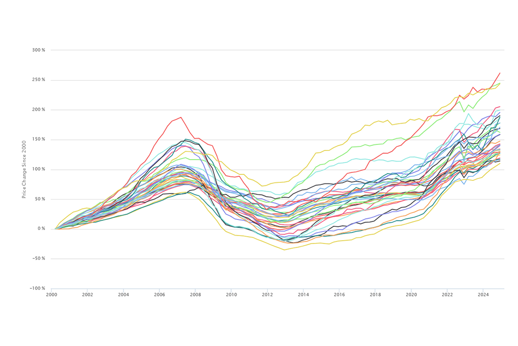
- Single family home prices in Cook County saw their largest year-over-year increase since at least 1998. Figure 1 illustrates the long-term single family home price trends in Cook County and in the two major subregions of Cook County: the City of Chicago and suburban Cook. It shows that in the third quarter of 2013, Cook County single family home prices experienced their fourth consecutive positive quarter with a particularly strong second quarter of 2013. Single family home prices reached their recent low point in the third quarter 2012, and, since then, year-over-year prices increased by nearly 13 percent. Figure 2 charts the quarterly year-over-year price increases for single family homes in Cook County since the first quarter of 1998. It shows the near 13 percent increase in the third quarter of 2013 was the largest year-over-year increase during that 16 year period. Conversely, the biggest year-over-year price decline took place in the second quarter of 2009, when single family home prices dropped by over 18 percent.
 Figure 1. Price Trend for Single Family Homes from Q1 1997 to Q3 2013
 Figure 2. Year-over-Year Price Increases for Single Family Homes in Cook County by Quarter from Q1 1998 to Q3 2013.
- Despite a large year-over-year increase, Cook County’s single family housing market is still in the early stages of a recovery. Compared to peak levels, single family home prices in Cook County are still down by more than 32 percent, and prices are at levels comparable to early 2002. This quarter’s large year-over-year price increase was built off a strong 2013 second quarter, and, despite consistent recent quarterly price growth, single family prices in the third quarter had the smallest quarter-over-quarter increase observed in 2013, rising 2.7 percent compared to the second quarter of 2013. By contrast, quarter-over-quarter price increases in the first and second quarters of 2013 were 3.2 percent and 6.3 percent respectively.
- As seen in previous quarters, single family home prices in the City of Chicago increased faster than in the suburbs. Table 1 compares price trends separately for the City of Chicago and suburban Cook County. Prices for single family homes in the City of Chicago increased by more than 13 percent compared to the third quarter of 2012. Prices for single family homes in suburban Cook County saw year-over-year increases of just under 13 percent. Single family home prices in the City of Chicago increased by just over 3 percent quarter over quarter and in the suburbs by roughly 2 percent quarter over quarter. As illustrated in Figure 1, single family homes in the City of Chicago have seen price increases in six of the past seven quarters. In suburban Cook County, single family home prices have experienced three consecutive positive quarters. Prices in the City of Chicago are at levels similar to late-2002, while suburban Cook County prices are at levels similar to mid-2001.
 Table 1. Change in Prices of Single Family Homes from Q1 1997 to Q3 2013
As discussed in the Second Quarter Price 2013 Index, single family home price trends vary significantly by levels of concentrated foreclosure activity in a neighborhood. IHS segmented neighborhoods into categories based on having low, moderate, and high levels of foreclosure activity. Areas with low levels of foreclosure distress are neighborhoods where less than 10 percent of all residential parcels have had at least one foreclosure filing between 2005 and 2012. Areas with moderate levels of foreclosure distress are those where between 10 and 24.9 percent of all residential parcels have been directly impacted by foreclosure. In areas with high levels of foreclosure activity, more than 25 percent of residential parcels have had at least one foreclosure filing between 2005 and 2012. See the Second Quarter 2013 Price Index for a map of neighborhoods in Cook County that fall into each of these groups.
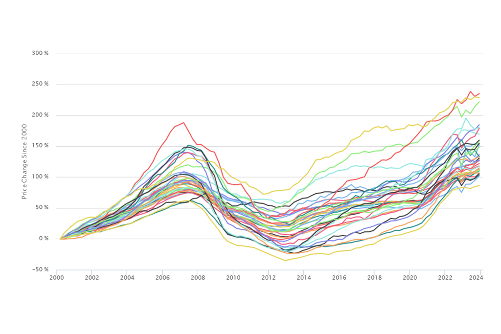
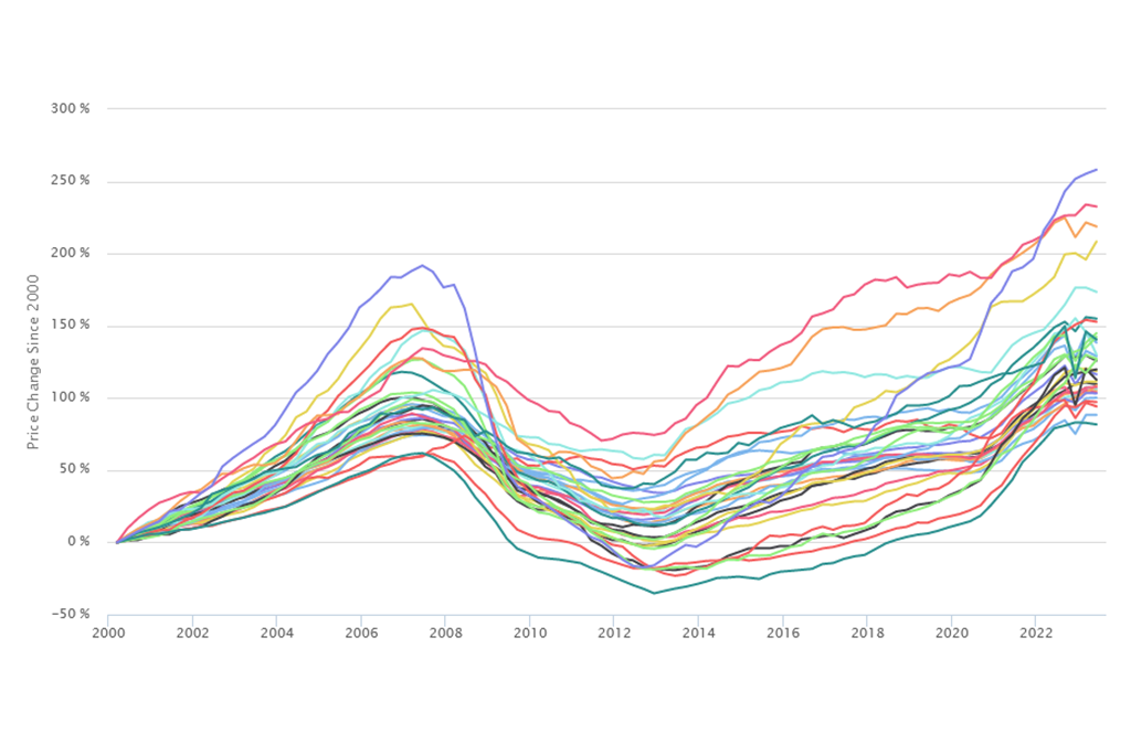
- Areas with low levels of foreclosure activity remain strong, with consistent quarterly price growth and price levels near recovery. Last quarter’s Price Index release illustrated that areas with low levels of foreclosure activity had emerged from the housing crisis on relatively strong footing, and in the third quarter of 2013 the single family home market in these low foreclosure areas continue to stabilize and improve. Figure 3 illustrates price trends for Cook County neighborhoods by foreclosure-distress level. It shows that prices for single family homes in low foreclosure areas have experienced five consecutive positive quarters and saw a 9 percent year-over-year increase when compared to the third quarter of 2012. These low-foreclosure areas also continue to inch toward a full recovery of peak prices. Figure 4 shows cumulative annual price changes from peak levels by neighborhood foreclosure levels. Low foreclosure areas of Cook County are now just 15 percent off peak levels. Prices in these low foreclosure areas are similar to those found in mid-2004.
 Figure 3. Price Trend for Single Family Homes in Cook County by Neighborhood Foreclosure-Distress Level, Q1 1997 to Q3 2013
 Figure 4. Cumulative Price Change for Single Family Homes in Cook County by Neighborhood Foreclosure-Distress Level, Q1 1997 to Q3 2013
- High foreclosure areas continue to show signs of improvement in the third quarter, although prices have a long way to go before they return to even 2000 levels. Previous analyses have shown that high foreclosure areas suffered the most dramatic price declines as a product of the housing and foreclosure crisis. Figure 4 illustrates that, from their peak, prices on single family homes in highly foreclosure-distressed markets have declined substantially, by more than 57 percent as of the third quarter 2013. Table 2 shows that when examining long-term price changes independent of the boom period, prices of single family homes in the third quarter 2013 were approximately 32 percent less than they were in 2000, and prices in these areas are well below what they were even in 1997. There were some positive signs in these areas, however. Figure 3 shows that prices of single family homes in high foreclosure areas have had four consecutive positive quarters and experienced a year-over-year price increase of more than 13 percent, the largest year-over-year price increase of all the neighborhood types.
 Table 2. Price Change for Single Family Homes in Cook County by Neighborhood Foreclosure-Distress Level, Q1 1997 to Q3 2013
Discussion
Data from the third quarter 2013 show the Cook County single family housing market continuing its recovery. The third quarter built on previous, strong quarterly increases and saw the largest countywide year-over-year price increases since at least 1998. Although the market has observed positive quarter-over-quarter increases throughout 2013, the small quarter-over-quarter increase seen in the third quarter could indicate a slowdown in price growth. While the recovery continues to be led by neighborhoods with strong housing markets that have relatively stable house prices and have seen limited foreclosure activity during the course of the housing crisis, the data also show some positive signs in neighborhoods with the highest levels of concentrated foreclosure activity. Despite prices well below 2000 levels, these areas experienced the largest recent price increases of all neighborhood types in the third quarter of 2013.