It’s no wonder that Chicago’s population decline has been the subject of quite a few recent news stories. Since 2013, Chicago has been alone among the top US cities to record annual population declines – and the slight increase in population since 2010 is still the weakest growth recorded among peer cities by a mile. Population changes are important for a number of reasons including the distribution of federal dollars, school enrollment, and the health of labor markets.
Despite the importance of population shifts to certain policy issues, it’s understanding changes in households, not population, that can tell us more about the economic challenges and opportunities facing a city and its housing markets. An increase in households indicates growing demand for housing, while a decrease in households can indicate declining demand. Of course, it’s also not quite that simple. How wealthy or poor households are is a key factor in understanding changing demand for housing across the city and its neighborhoods.
For example, all of the cities in Figure 1 below saw substantial growth in the share of households that were earning more than $100,000 since 2010. Growth in this highest income bracket was particularly notable in New York, Los Angeles, and Chicago not only because of the scale of the increase but also because households earning over $100,000 grew to become the predominant type of household (or close to it) in each of these cities.
 Figure 1. The Composition of Households by Income in the City of Chicago and Five Most Populous U.S. Cities, 2010 and 2016
IHS produced this analysis as part of a larger project commissioned by the City of Chicago to build data to inform advisory group discussions around the City’s next Five-Year Housing Plan. Seen at a high level, these data point to seemingly contradictory trends of a shrinking city with growing prosperity, but when examined at the neighborhood-level, like in Figure 2 below or the map at the bottom of this post, the data reveal that both of these stories are true. Some neighborhoods are gentrifying with substantial growth in higher-income households, while others are seeing a growth in low-income households. Still, others are experiencing declines in households at every income level. Variations across neighborhoods highlight the spectrum of issues faced by our communities and also point to the need for policy remedies to address the unique challenges of each neighborhood type.
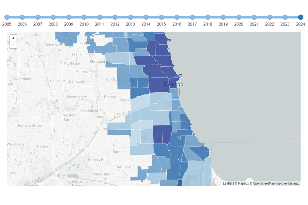
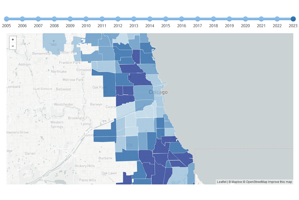
 Figure 2. Shifts in Households by Income, Chicago Community Areas, 2010 and 2016. Click here to display the chart in a new page as a downloadable PDF. The data is also presented as a map at the bottom of this page and illustrates household change for all households and by income bracket. Click the buttons at the bottom of the map to change the income bracket displayed on the map. Click on a community area to reveal a pop-up with the estimates of household change.
Likely gentrifying neighborhoods
When we think of neighborhood change, especially by income, we often think of gentrification—an increase in high-income households that pushes out and replaces lower-income households. The trend is as stark as one would expect in areas like Logan Square and West Town, with nearly equal numbers of lower-income households seeming to be moving out as higher-income households moving in (Figure 3). Overall, these neighborhoods often have rather small decreases in overall households as growth in higher-income households is an indicator of shifting demand for housing which might lead to activities like conversions, where a 2-4 unit building is renovated into a single-family home. This activity may help explain how the number of households in Lakeview and Logan Square dropped by -2.9 percent and -2.5 percent, respectively even though these real estate markets are among the strongest in the city. Bucking the trend, West Town saw its share of upper-income households increase while still seeing an overall increase of households by 1.4 percent, most likely due to an increase in new construction.
Trends in Lakeview, West Town, and Logan Square illustrate the clearest pattern of succession of low-income households by high-income households, but the trend is also apparent in several other neighborhoods including North Center, Albany Park, Uptown, Portage Park, Belmont Cragin, and Lincoln Park.
 Figure 3. Community Areas illustrating gentrification
Growth led by lower-income households
If lower-income households are being displaced, where are they going? A handful of neighborhoods where new household growth is driven almost entirely by lower-income households may provide some answers. South Lawndale, Chicago Lawn, and Rogers Park each recorded over 1,000 additional households earning less than $50,000 between 2010 and 2016 (Figure 4). To a lesser degree, Douglas, Riverdale, Gage Park, and Brighton Park also saw growth in households in this income bracket. Most of these neighborhoods experienced an increase in households overall, except Chicago Lawn which experienced a nearly equal decrease in the number of households earning between $50,000 and $100,000 which resulted in an overall household growth of just 1.2 percent.
 Figure 4: Community Areas with a growing number of low-income households
High household growth led by high-income households
Several neighborhoods surrounding the downtown core—the Loop, Near North Side, Near West Side, and Near South Side—saw increases in the total number of households driven primarily by high-income households (Figure 5). These are also the neighborhoods with the greatest household growth overall and only the Near North Side saw a decrease in lower-income households in this time frame. The growth in lower-income households was not as high as the number of higher-income households likely moving in, but the Loop and Near South Side saw significant growth in the number of households earning less than $50,000, with increases of 44.1 percent and 14.3 percent, respectively. In fact, the Loop saw the highest percentage increase of households earning under $50,000 than any community area and the second highest increase in the absolute number of households with the addition of an estimated 1,490 households.
 Figure 5. Community Areas with the highest growth in households
Decline across the board
Finally, there are neighborhoods experiencing an overall decline in households, many of which are losing households across all income levels. Englewood, Chatham, Greater Grand Crossing, and South Chicago all saw relatively large decreases in the overall number of households, with reductions between 10 percent and 20 percent in each neighborhood (Figure 6). That many of these communities are primarily African American raises concerns about the disproportionate impact of these trends on Chicago's African American population. These neighborhoods have been challenged by decades of disinvestment, long-term population loss, as well as the recent foreclosure crisis and increasing demand for housing continues to be a priority for many neighborhood organizations and agencies.
 Figure 6. Community Areas with the largest loss in households
Understanding Neighborhood Change
What's behind the loss of low-income households in Albany Park or Portage Park is likely different than the drop in low-income households in Englewood and Chatham. Likewise, each community will require different strategies to address challenges associated with household growth, decline, and shifts in neighborhood income levels. The need for policies that address the distinct needs of communities is what drives IHS to develop data and tools that aid policy-makers and community leaders in understanding current trends and crafting effective policies.
Explore the map below to see how these trends and patterns vary across the city. Click the checkboxes on the right to change the income bracket displayed on the map. Click on a community area to reveal a pop-up with the estimates of household change.