The Housing Market Conditions Report is released in conjunction with the annual update of the IHS Housing Market Indicators Data Portal. This edition of the report uses a lens of housing market health to focus on differences in housing indicator activity in different types of markets broken out by long-term price trends. The objective of the report is to help users of the IHS Housing Market Indicators Data Portal understand how these indicators, such as foreclosure distress, property sales, and mortgage lending, vary within the broader context of housing market health. A secondary objective is to provide a context in which stakeholders can better understand the relevance and interconnectivity of IHS Housing Market Indicators data.
Examining Cook County submarkets broken out by long-term price trends
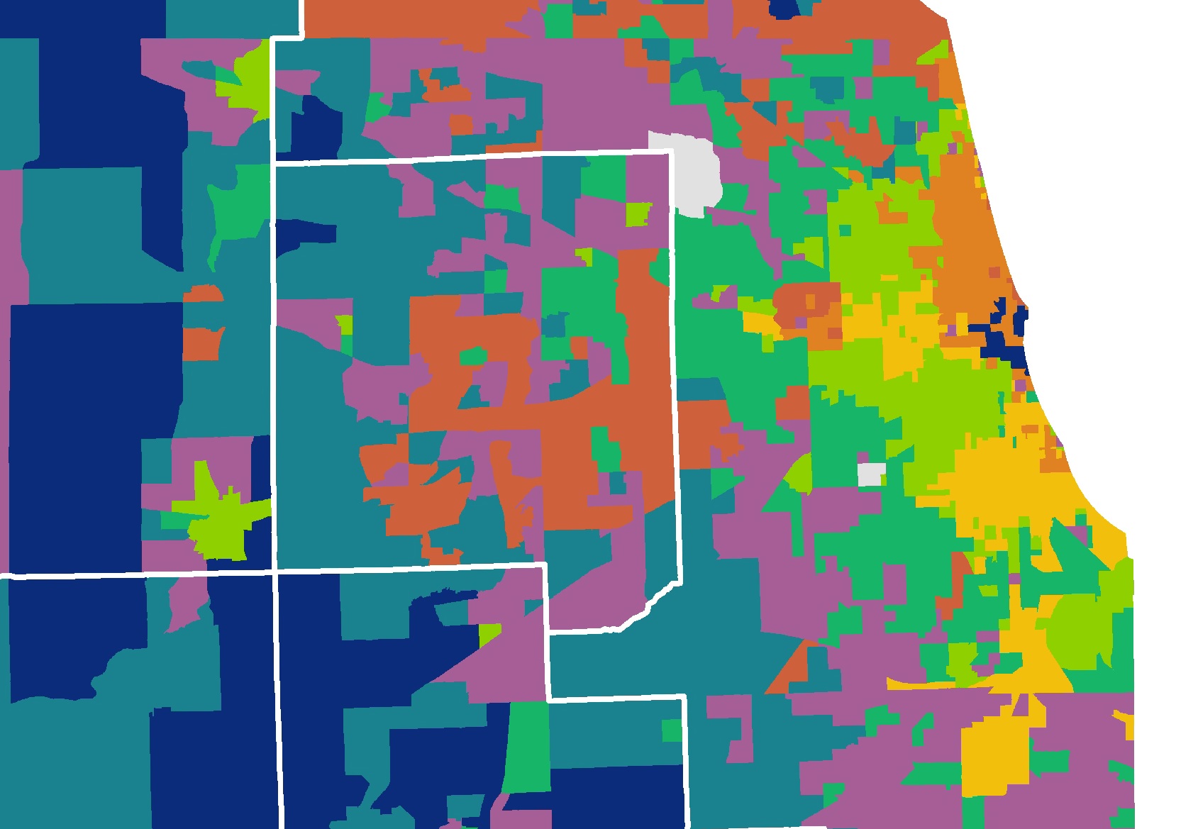
The following analysis shows how trends in key IHS Housing Market Indicators vary across three Cook County submarket types: strong price growth, moderate price growth, and declining price areas. Submarket groupings are based on long-term price trends taken from IHS’s Cook County House Price Index. While the county is still recovering from the boom-and-bust cycle that affected house prices starting in the mid-2000s, most areas have experienced some nominal price appreciation since 2000, and these long-term price trends can be indicative of the fundamental strength and stability of an area’s housing market. Countywide, single family home prices increased by roughly 20 percent from the first quarter of 2000 compared to the fourth quarter of 2013, but within the county there is wide variation ranging from areas with price-growth rates over 60 percent to some areas where prices in the fourth quarter of 2013 were less than what they were in 2000. Figure 1 highlights the distribution of these submarkets in the county and underlying price-trend data can be found here.
The discussion below highlights historical and recent trends in levels of foreclosure distress, property sales, and levels of mortgage credit between 2005 and 2013 across these three market types. To learn more about the IHS Data Clearinghouse and the data used in this report click here. To examine patterns of activity for these and additional data sets at different units of geography throughout Cook County, click here.
 Figure 1. Single Family Price Change Since 2000 by Cook County Submarket
Key Trends in Neighborhood Housing Market Indicators:
Foreclosure Activity
This section examines overall levels of foreclosure distress and the variation in annual levels of foreclosure filing and real estate owned (REO) activity in each market type. Data for the region, for Cook County municipalities and for city of Chicago community areas and wards can be accessed via the IHS Housing Market Indicators Data Portal.
Areas with declining house prices have consistently had the highest levels of annual foreclosure filing activity in the county, although this activity declined in 2013. Figure 2 details the annual levels of foreclosure activity per 100 parcels by neighborhood market type between 2005 and 2013. It shows that declining price markets have consistently had the highest levels of annual foreclosure activity, and that filing activity in these areas peaked at 5 filings per 100 properties in 2008. Foreclosure filing activity in these areas has slowed in subsequent years. Conversely, in both strong and moderate price growth areas, annual foreclosure filing activity has been lower, and activity peaked in these areas later in 2010.
Notably, new foreclosure filing activity decreased significantly between 2012 and 2013 in all markets. During this period, the level of foreclosure filing activity went down by more than 40 percent in declining price markets, by nearly 38 percent in slower price growth markets, and by roughly 35 percent in stronger price growth markets.
 Figure 2. Foreclosure Filings per 100 Residential Parcels by Long-Term Neighborhood Price Trend, 2005 to 2013
All markets experienced some clearing of the foreclosure pipeline in 2013, but REO activity continued to increase in declining price markets while remaining flat elsewhere. Figure 3 examines the flow of residential properties completing the foreclosure process and entering REO status each year from 2005 to 2013. Properties entering REO status are owned by lenders who have the responsibility of maintaining, marketing, and selling the property.
The chart shows that the level of REO activity peaked in 2009 and 2010 and declined through 2011 in all geographies. This decline in REO activity was the product of disruptions in the foreclosure process caused by the robo-signing scandal and other policy interventions that caused a dramatic slowdown in the foreclosure pipeline.
With the completion of the National Mortgage Settlement in 2012, the foreclosure process started to move again, and REO activity increased countywide through 2012. While REO activity decreased slightly or remained flat between 2012 and 2013 in strong- and moderate-price-growth markets, REO activity continued to increase in declining price or weak markets. Increased REO activity signals a growing inventory of distressed properties in declining price markets, and, in the short term, this could serve to further dampen prices in these areas. However, when coupled with declining levels of new foreclosure filings, the increasing number of properties completing the foreclosure process suggests a clearing of the foreclosure pipeline. This will help reduce the backlog of foreclosure cases in the Cook County court system, a critical step in achieving stability and returning to a more normal housing market.
 Figure 3. REO Activity per 100 Residential Parcels by Long-Term Neighborhood Price Trend, 2005 to 2013
Despite recent declines in new foreclosure filings, persistent and high levels of foreclosure activity have left certain areas weak and significantly foreclosure distressed. Figure 4 illustrates the share of residential parcels in each market group that had at least one foreclosure filed against it between 2005 and 2013. Not surprisingly, it shows that declining price areas have seen the most dramatic growth in accumulation of properties impacted by a foreclosure - with more than 27 percent of all the residential parcels having had a least one foreclosure filing since 2005. This is compared to stronger price growth areas where less than 12 percent of the parcels have been impacted by foreclosure over the same period. Areas with high levels of foreclosure distress typically have significant challenges associated with vacancy and blight. These significantly foreclosure-distressed areas are largely concentrated in city of Chicago community areas on the south and west sides of the city and in municipalities in south and west Cook County.
 Figure 4. Cumulative Percent of Parcels Impacted by a Foreclosure Filing by Long-Term Neighborhood Price Trend, 2005 to 2013
Property Transactions
The level and characteristics of property sales is an important indicator of neighborhood housing market health. This section examines variation across market types in the method of acquisition and type of sale, the levels of investor buyer activity, and the share of properties purchased for low values between 2005 and 2013. The same information for a variety of Cook County geographies is available via the IHS Housing Market Indicators Data Portal and more information about using this indicator is available here.
As the foreclosure and economic crisis has unfolded, cash sales have become increasingly common, particularly in declining price markets. Figure 5 examines the composition of annual residential sales activity in each market type and illustrates the share of sales in a given year that were purchased in cash or financed with a mortgage and whether that purchase was associated with foreclosure. Between 2005 and 2013 there was a dramatic shift in the way properties were acquired. In Cook County in 2005, more than 85 percent of properties were acquired using a mortgage, but, by 2013, this number declined to roughly 60 percent of purchases. Figure 5 shows that, while cash buying activity has increased in all markets between 2005 and 2013, it has become the most common method of purchase in declining price markets. This is compared to stronger markets, where despite declines in mortgage credit throughout the crisis, mortgage-financed home purchases continued to make up the majority of sales between 2005 and 2013.
Figure 5 shows that increased levels of cash activity in all market types has been largely driven by growing distressed-sales activity starting in 2008. In 2013, nearly 30 percent of sales Countywide were distressed sales. This activity is concentrated in declining price markets, where over 47 percent of all sales were distressed sales. In stronger markets, roughly 20 percent of sales in 2013 were distressed, and, in fact, the majority of cash purchases in stronger markets have been of non-distressed properties. While cash distressed sales continue to be the most common type of purchase in declining price markets, cash non-distressed transactions are making up a growing portion of activity in these markets. In these markets, non-distressed cash sales increased to 25 percent of all sales in 2013 from just over 8.2 percent of sales in 2008.
 Figure 5. Composition of Residential Purchases by Method of Acquisition and Type of Sale by Long-Term Neighborhood Price Trend, 2005 to 2013
The share of single family homes and condominiums being purchased by investors increased substantially after 2007, particularly in declining price markets. Figure 6 shows the share of annual single family and condominium sales that were purchased by self-identified business buyers and the variation across market types. It illustrates that single family homes and condominium business buyer activity increased in all markets between 2005 and 2013. However by 2013, business buyers’ activity had increased to account for nearly 34 percent of all single family homes and condominium purchases in declining price markets, but only 14 percent of purchases in markets with strong price growth.
Business buyers represent a range of investor types from small mom-and-pop investors to large Wall Street-traded equity funds. These large, institutional investors, for example, represented a growing share of investor buyers in 2013 as they purchased lower-value and foreclosure-distressed single family properties to convert to rental housing. Data on the annual share of residential sales purchased by business buyers by property type and geography can be accessed via the IHS Housing Market Indicators Data Portal.
 Figure 6. Share of Single Family and Condos Purchased by Investors by Long-Term Neighborhood Price Trend, 2005 to 2013
Extremely low value sales are decreasing but continue to make up a substantial portion of property sales in declining price markets. As a result of a significant foreclosure distressed market, the share of non-condominium sales purchased for amounts less than $20,000 skyrocketed in weak markets post-crisis. Figure 7 shows the share of single family and multifamily transactions in a given year that had sale prices less than $20,000 - considered to be an extremely low sale price in any market. It shows that prior to 2009, extremely low value purchases were virtually nonexistent in all three market types. Previous IHS research has shown that extremely low value purchases are highly correlated with cash and distressed sales. This is illustrated in Figure 7 where the share of sales less than $20,000 is highest in declining price markets, and that these sales peaked in each market in 2009 just as levels of REO properties reached their highest levels as seen previously in Figure 3.
While extremely low value purchases have declined countywide since 2009, a large share of non-condo sales in weak markets continued to sell for extremely low values in 2013. Property sales for less than $20,000 represented over 15 percent of all sales in declining price markets in 2013 but accounted for less than 2 percent of sales in moderate price growth markets and less than 1 percent of non-condo sales in strong price growth markets.
 Figure 7. Share of Non-Condo Sales Purchased for Less than $20,000 by Long-Term Neighborhood Price Trend, 2005 to 2013
Mortgage activity
Mortgage activity data measures the flow of mortgage credit into an area and is indicative of the level of lender investment. The level of mortgage activity in a neighborhood relative to other areas can be used to assess how access to credit has changed over time in a community and how the flow of credit differs across geographies and for different property types within a geography. These data group home purchase and refinance mortgages and can be accessed via the IHS Housing Market Indicators Data Portal for the region, for Cook County municipalities, and for city of Chicago community areas and wards between 2005 and 2013. To learn more about IHS’s mortgage data click here.
After mortgage activity declined in all markets as a result of the housing crisis, activity increased significantly in strong and moderate growth markets in 2012. Figure 8 examines variation in the density of mortgage activity between 2005 and 2013. It shows that mortgage activity began to taper in 2006 and declined sharply after 2007, particularly in declining-price markets, reaching its lowest levels countywide in 2011. In 2012, mortgage activity increased in all markets, particularly in strong and moderate markets as a result of increased demand for refinance loans among current homeowners.
Notably, mortgage activity per 100 parcels declined in strong- and moderate-growth markets in 2013 as a result of increased interest rates and declining demand for refinance credit. At the same time, mortgage lending activity increased in weaker markets in 2013 likely as a result of increased home purchase financing.
 Figure 8. Mortgage per 100 Residential Parcels by Long-Term Neighborhood Price Trend
Conclusion
This analysis illustrates how neighborhoods with different long-term price trends can exhibit distinct patterns of residential real estate market activity. House price trends are one of the most important ways to measure the health of a local housing market, but understanding the underlying characteristics of real estate market activity is necessary to identify the key levers available to inform actionable policy development. Given the recent boom-and-bust cycle of the housing market, areas with the strongest long-term price growth are those that have been less impacted by foreclosure activity, have strong demand from owner occupants, and have more steady access to mortgage credit. On the other hand, neighborhoods that have seen long-term price declines since 2000 are often those with higher levels of foreclosure distress, where buying is dominated by investors, and that have limited recent access to mortgage credit.
IHS Housing Market Indicators Data can help users understand key trends in their local housing markets and, with this information, develop and target policies and programs to improve neighborhood stability. To learn more about the IHS Data Clearinghouse and the data used in this report click here. To examine patterns of activity for these and additional data sets at different units of geography throughout Cook County, click here.